Games


2D Art


3D Models


Payday 2 UI Redesign
Improve Payday 2’s HUD and menus to be clearer and either hide or condense the amount of information being presented at one time.
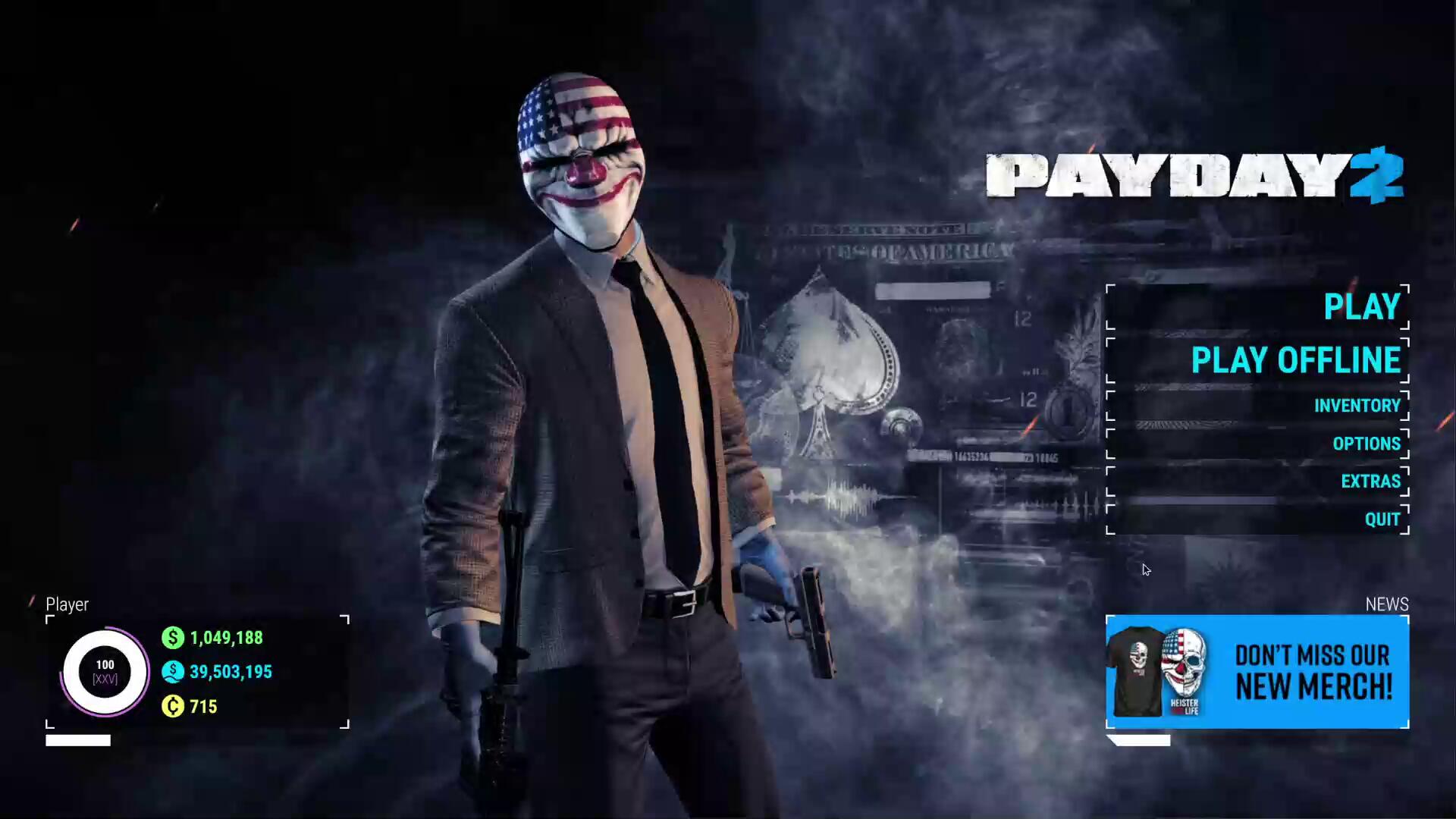
Payday 2 is a four player co-op FPS where players rob banks and get paid. Players can create various builds using different combinations of guns, skills and perks that change the gameplay drastically.Payday 2 is a game close to my heart which is why it saddens me to say a lot of its UI design isn't very good. Some menus are too simple and others are too complex, an issue stopping some people from getting into the game.For this project, I redesigned Payday 2's HUD, Main Menu, Inventory Screen and Weapon Selection Screen, keeping in mind both veteran players and newbies to the franchise.
Final Prototype
Includes the Main menu, Extras menu, inventory, weapon selection, weapon preview and in-game HUD! You can exit menus and pause in the HUD with P.
Player Personas
Locke (Payday 2 Fan)
Plays the game regularly
Familiar with the game’s HUD and menus, not receptive to change
Uses mods to improve the HUD and the information shown

Dallas (Co-Op Shooter Fan)
Plays co-op shooters with friends, will try out anything at least once
Friend group will not commit to difficult games, looking for a fun time, not a hard time
Is familiar with the general gameplay mechanics of the genre, but not anything game specific.
Bain (Streamer)
Streams games to thousands of people, tries to keep things entertaining
Unfamiliar with Payday 2, found out about it through friends who play the game
Looking to get into the game and make videos about it, getting other people interested in trying it out
Reference Images


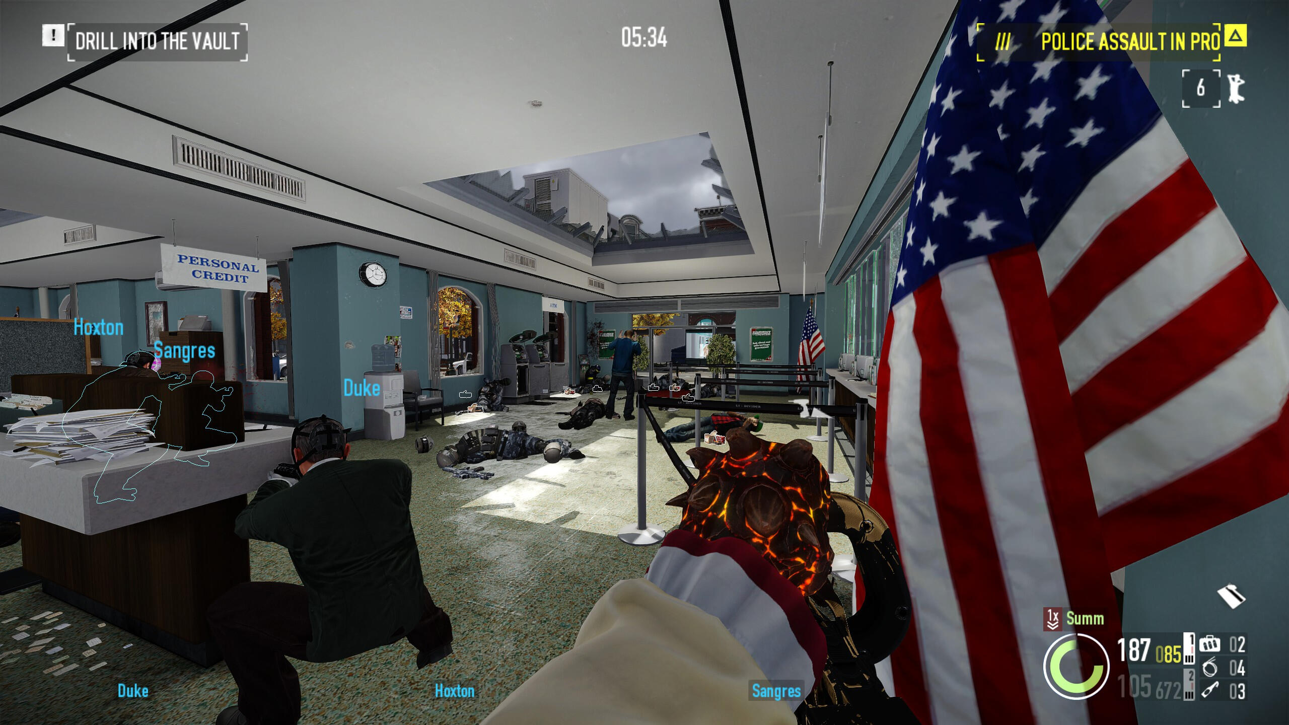
Heading in-game and gathering screenshots for reference provided me with both good visual reference and also hands-on experience with some of the ways this game's UI fails.As mentioned before, the game's HUD hides certain information deemed useful by most players. HUD modifications can expose this hidden info and make the gameplay experience much smoother.The game can also be confusing with how it presents data. Weapon stats are presented as numbers with no bars providing easy visual reference for how strong a gun is.
Investigations
HUD
Payday 2’s HUD is simple, although because of this, it lacks information in a few key areas. The first is the objective indicator. It will only show one objective at a time, even on heists with multiple simultaneous objectives, and will often shorten the objective description, even when unnecessary.
The second is what the HUD doesn’t show. Payday 2’s player load-outs make use of a lot of stats that are hidden in-game, such as dodge chance, concealment and stamina. Showing these would allow players to make better use of limited time buffs.
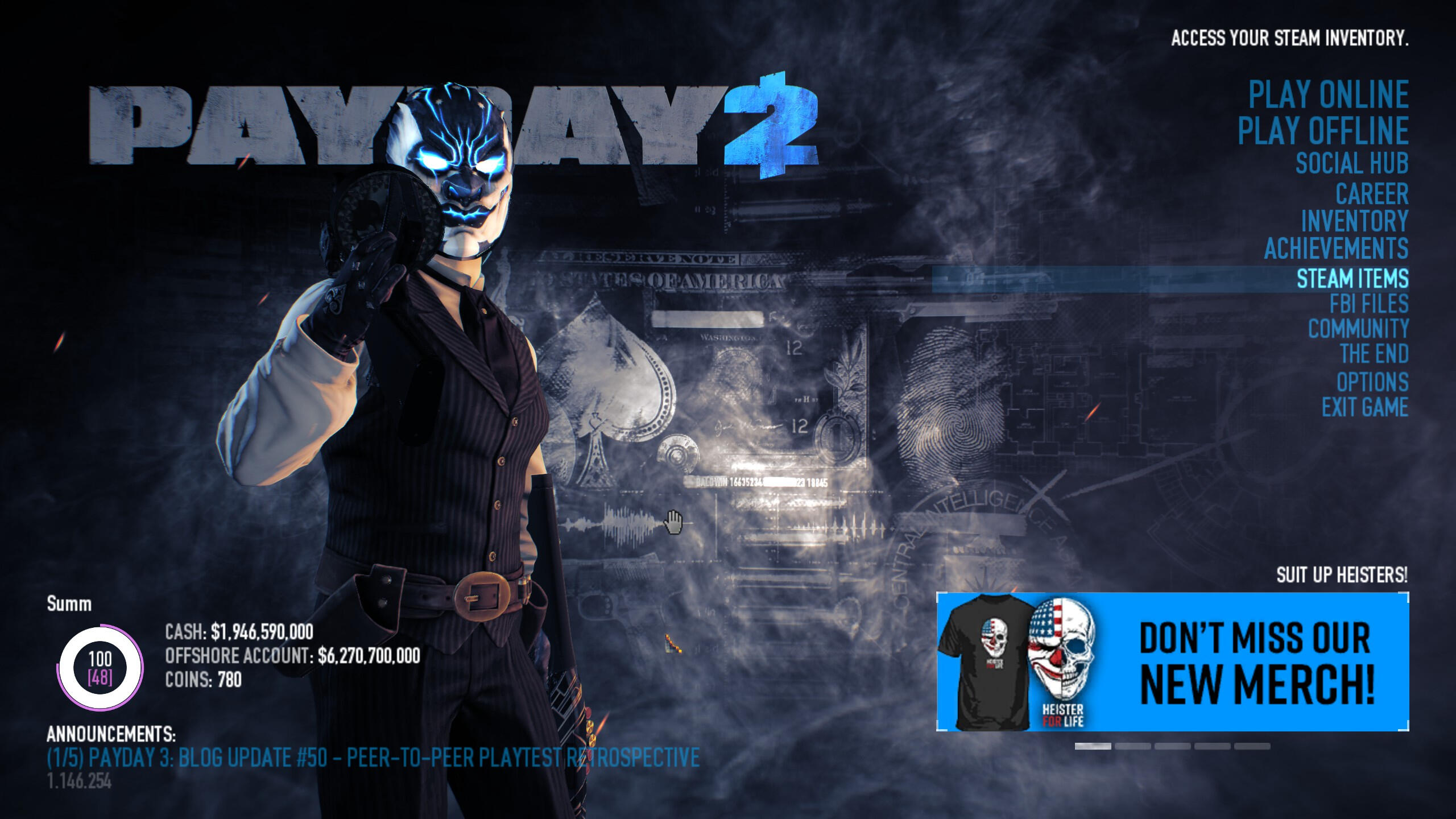
Main Menu
Payday 2’s main menu contains far too many options, many of which lead to pages outside of the game itself, or are only pressed once and never again. I would remove these superfluous options or condense them into an “Extras” submenu.
Another problem is how the space is used. The main menu itself is a simple list with the two play buttons being slightly larger to signify their importance, but I believe this menu could be made larger and easier to navigate if UI elements such as the news panel were either made smaller or removed entirely.
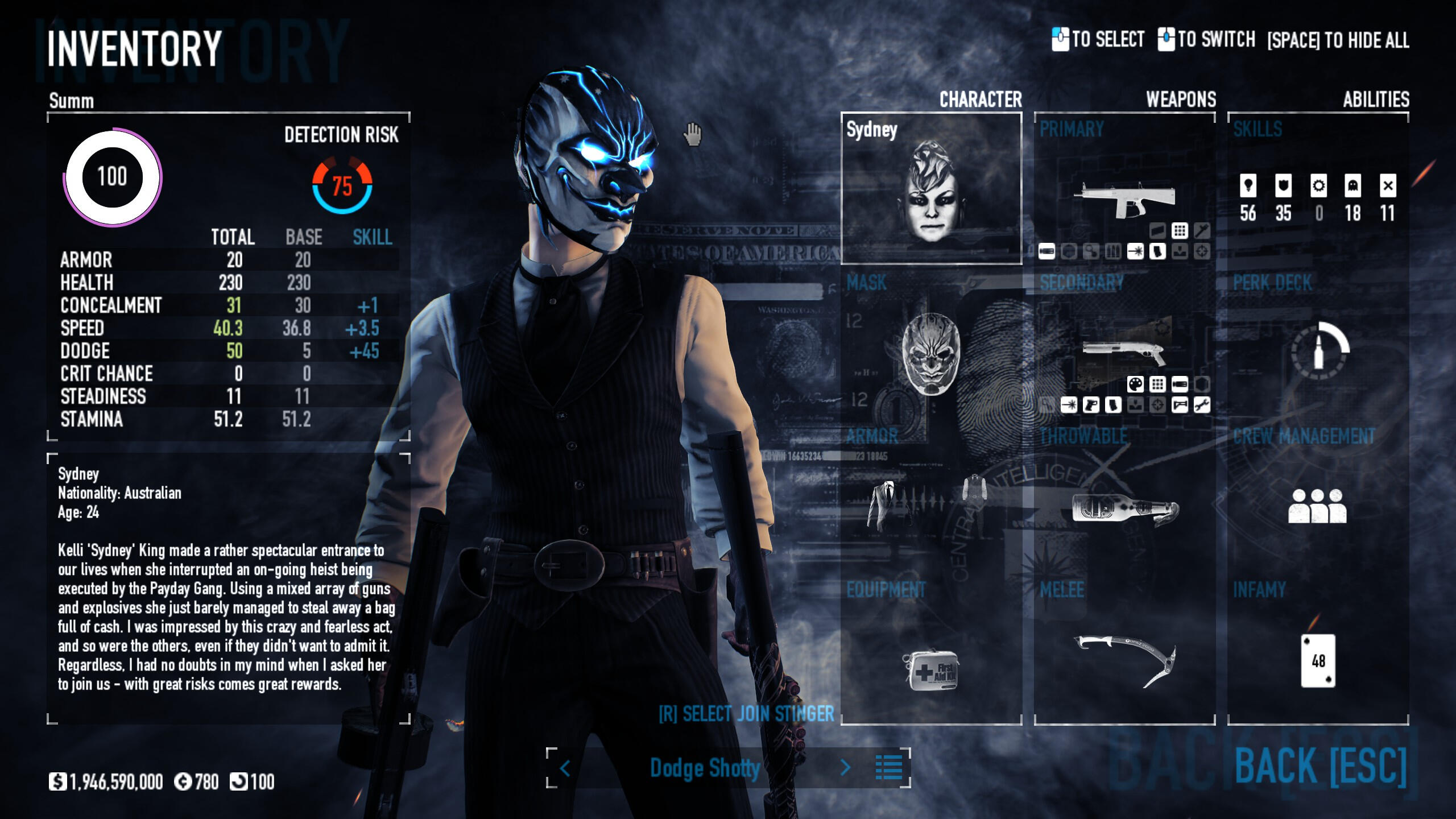
Inventory
The inventory screen has already been redesigned once before, as with more options being added it was required for a new menu to house them all. But since the redesign, even more options have been added, and these have not been properly fitted inside the inventory screen. The Join Stinger and Outfit options especially feel out of place and should have more of a presence in the menu.
The stats panel on the left also contains some superfluous info players do not care about such as steadiness and stamina. These would be hidden to emphasise the stats that matter.
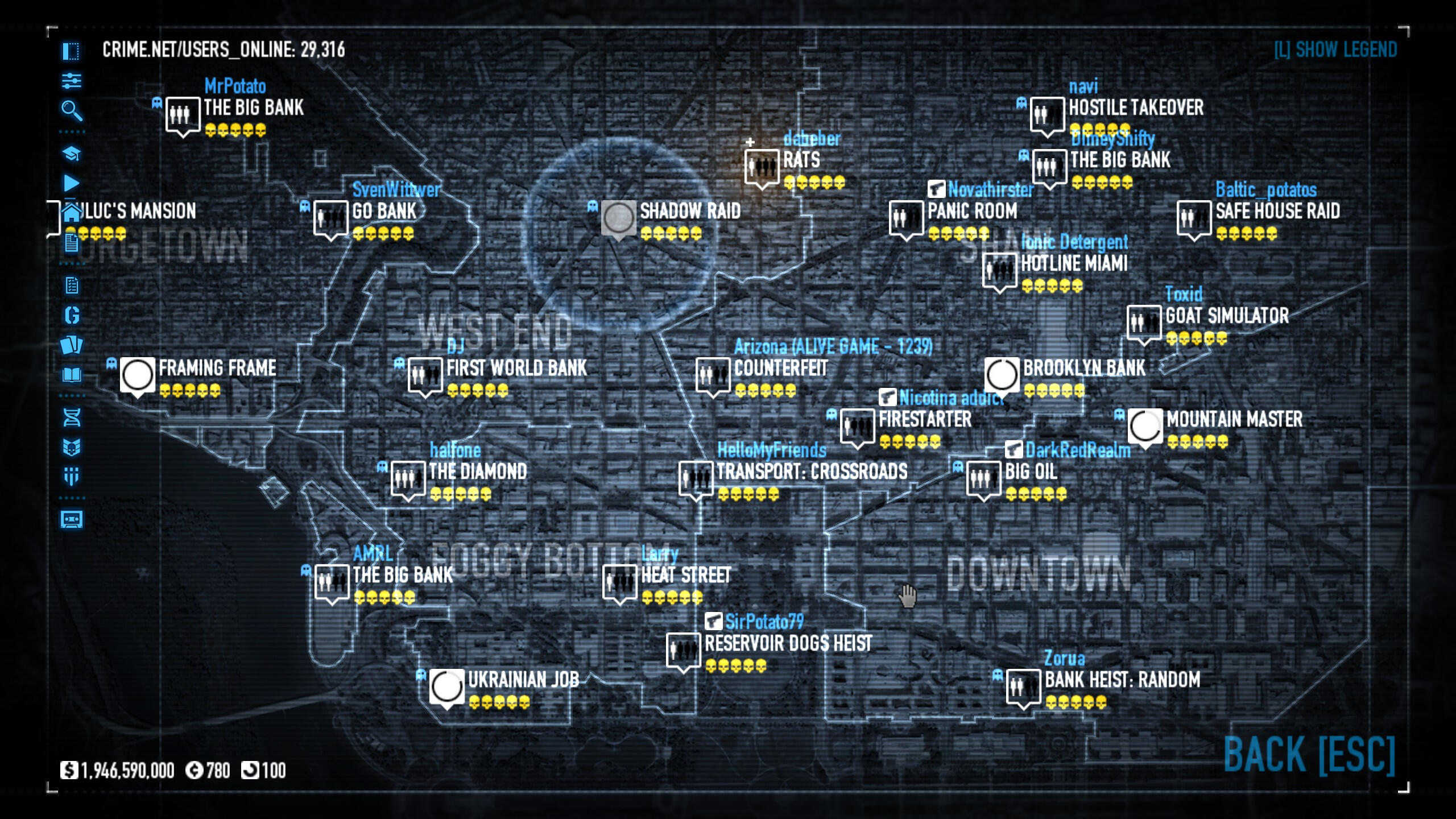
Lobby Selection
The CRIME.NET lobby selection screen is bad. Games randomly pop up on a map with no option for an alternative list. I would get rid of the current screen and replace it with a new, simpler menu that showcases lobbies in an organised list, and make the contract broker (host game) button more emphasised.
There are also many options on the left side of the screen that are never utilised such as the alternative game modes, Gage Packages, and Lost tapes. I would either remove these options from the menu entirely or condense them into a submenu.
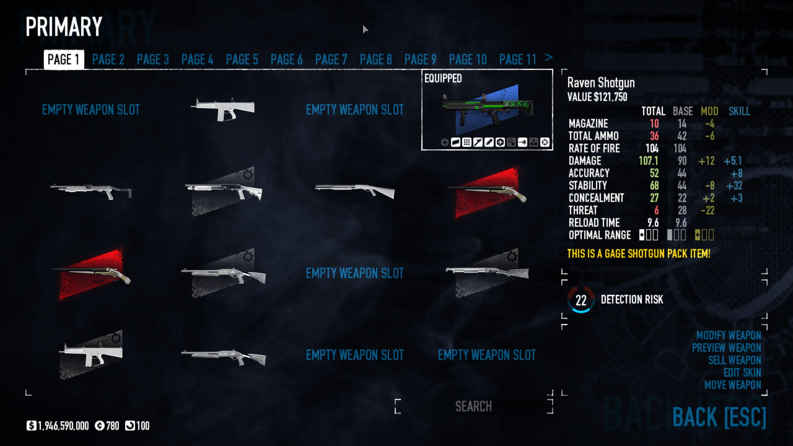
Weapon Selection
The weapon selection screen splits guns up into pages, emphasising their stats on the right side of the screen and showing how the player’s weapon mods and skills change the gun’s stats from base. Instead of splitting the menu into pages, I would instead make this into a vertical list with the same grid layout. The menu also has an aesthetic problem, as the gun icons are represented using simplified colours rather than full renders of each weapon. It is also missing crucial functionality such as drag and drop for moving guns around.
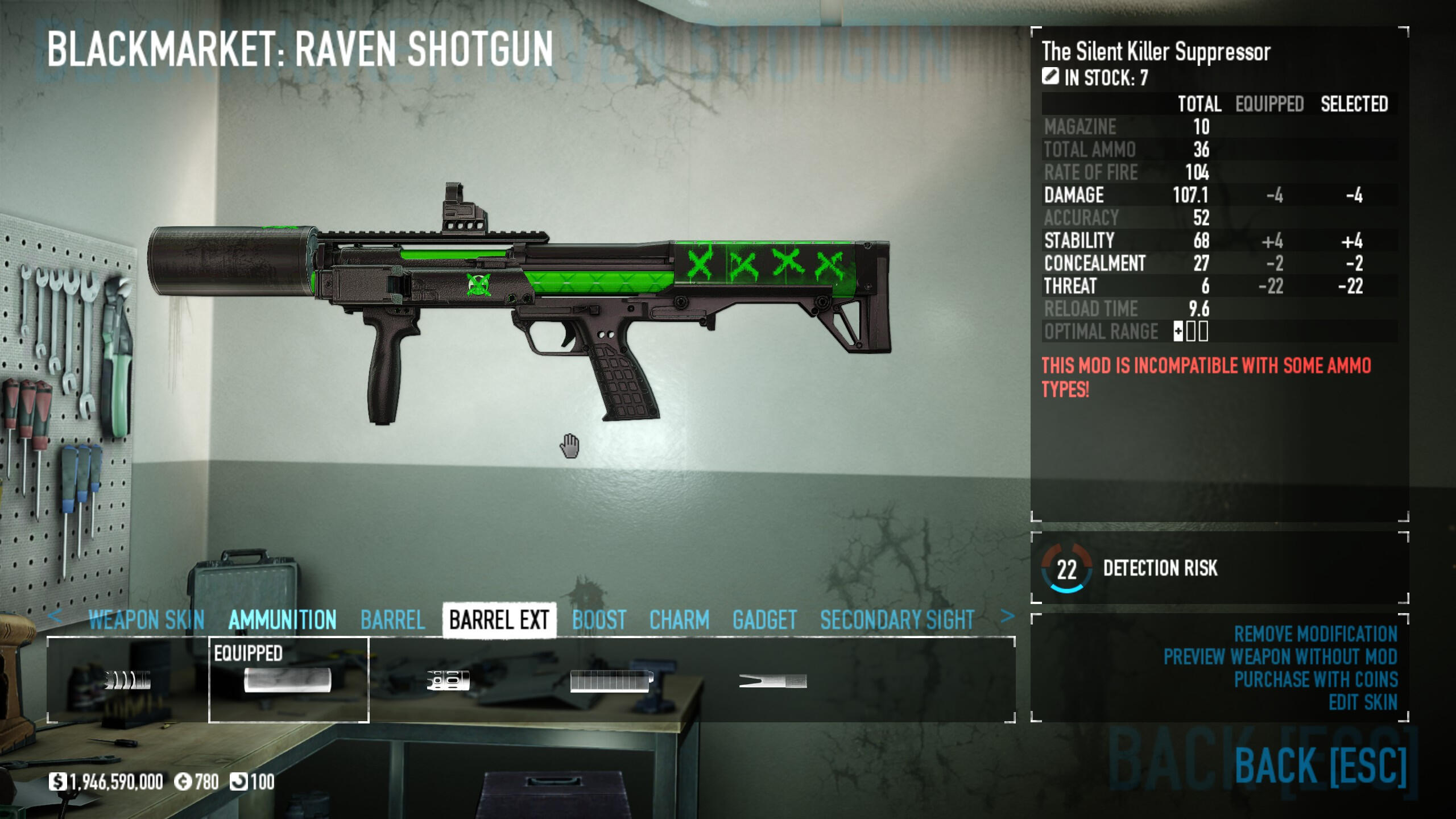
Weapon Modification
The weapon modification screen has similarly received a redesign in the past, that improved certain aspects while making others worse. The stats panel has a large amount of empty space and the weapon mod menu is too small for everything it is trying to display.
I would swap the positions of the stats and mod selection as the stats don’t need nearly as much space as they’ve been given the the mod selection has been given far too little space, making navigating to certain weapon mods tedious.
Flow Diagram
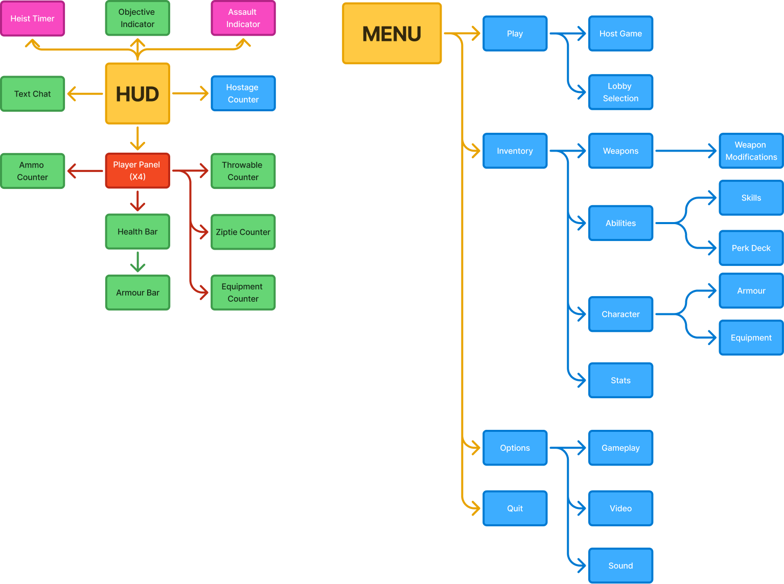
Flow diagram visualising both how the HUD groups its information and how the player navigates through the menus. This provided a good point of reference to how I should lay out my own menus.
Scamps


When drawing my scamps I wanted to lay out my ideas early while still allowing for iteration down the line. The designs shown here did not make it through to high-fidelity laid out exactly the same as I made lots of small changes as I iterated and refined the graphical design.
Low-Fidelity Wireframes


With the low-fidelity wireframes I wanted to refine the designs I had while addressing the feedback I had gotten from the scamps. On certain screens like the HUD, information was rearranged to make better use of all 4 corners of the screen.
High-Fidelity Wireframes


The high-fidelity stage involved even more refinement and taking in feedback I had received. I brought the UI closer in line with Payday 2's design language, and added additional information to the HUD as Payday 2 has many HUD elements that are only temporary or only appear during animations and then vanish.In making this UI redesign I was able to understand not only Payday 2's visual language, but also how the years of updates have changed how the UI is designed. The UI has been redesigned and information has been exposed based on community feedback.Due to Payday 2's modding support, implementing these designs in the game itself is in fact quite possible, and something I might look into trying out in the future.
Hi, I'm Andrew Coleman!
I am currently a second-year Games Design student at University, focussing on game design and character design. I have been drawing as a hobby for 5 years now, and more recently been creating small games, both for game jams my own personal amusement.I love working with others and have worked on a multitude of projects with like-minded individuals over the course of the past four years, from College to University, in a variety of roles from game design to programming, and even art! I hope to improve my abilities even further by gaining experience in the industry.You can contact me through any of the methods on the footer of the page.
Light Up The World
Crow-Bot is a 3D Platformer I designed, modelled and textured from the ground up for an end-of-year college assignment. It involves the main character, Poe, collecting lightbulbs to light up the world.
Art from this project


Gravi-T is a 2D platformer where you can control gravity! Help Gravi the robot traverse the dangerous caves and get to the exit at the end of each level. It's not as easy as it looks...Gravi-T was designed, programmed and drawn from the ground up for an end-of-year college assignment. Everything except the sounds were made by me.


Development Material
Gravi-T was based off of a prototype I had created a year prior with a basic environment and ability to rotate gravity. For the full game, I knew I wanted to add to it while trying new things both with gameplay and art.On the gameplay side, I learned a lot from Gravi-T as I learned how to properly implement game options and utilise post processing.
On the art side, I made use of parallax backgrounds and a 2D rig on Gravi, the main character, as I wanted to create animations quickly without having to make new frames on a sprite sheet. I really like the look!


Art from this project
With Gravi-T, I knew I wanted a robotic main character, but I wasn't sure how to go about the design. Typically when it comes to character design, I come up with the designs spontaneously, and that's exactly what happened here! The detached limbs made a 2D rig easy and I could make a sprite sheet containing all the body parts I needed for every animation.


")


ByteSized is a physics-based puzzle game about getting a ball to the end of a level... but you can't control it directly! Instead, you must use little machines called "Nodes".
The game's user interface design takes a large amount of inspiration from Windows XP and early 2000s technology.I made ByteSized in 4 months as the final assignment in my first year of university. The prototype is very short, but it's fairly polished! Everything (aside from music, sounds and the green field image) was made by me!


Development Material
With the development of ByteSized I knew I wanted similar gameplay to games such as Cut the Rope, where you only influence the object to its goal, rather than directly moving it. I created a few different "nodes", which are objects placed in the level that can be controlled and used to move the power core around. It can be pushed, sucked up, and even teleported!


Art from this project
I knew that I wanted ByteSized to be a 2.5D game making use of 3D models with pixelated textures. Using a low poly art style meant I could complete models quickly and get them working in game without having to spend too much time on the art.One thing you'll notice about a lot of this art is that it's for things not in the final game. I had to cute quite a lot during the development of ByteSized! I originally wanted 2 main characters (Byte and Malvir) and a smaller generic enemy character (Nibble) and I did create designs for them, but unfortunately due to time constraints I was not able to implement them in-game as I would have liked.


Exploring a forgotten temple, you'll find your reflection can wander off! MIRRIM is a 2D puzzle platformer where you control both yourself and your reflection simultaneously, opening up a world of possibilities for puzzles and solutions.Developed in 4 weeks in a team as part of a University assignment. I helped with programming and art!


Development Material
MIRRIM's development was a bit different than I was used to because I was working in a team. Before, I was used to having a hand in a little bit of everything, but with MIRRIM, I had a team member doing most of the art and another doing most of the levels. I quite enjoyed the experience, because while I did miss being as involved as I used to be, it meant that others could fill in the areas I wasn't strong in.On MIRRIM, I:
Chose the game's name
Created the game's logo
Designed the game's UI and created many different graphics for it
Assisted the lead artist with sprite edits
Programmed the player and mirror player movement
Lever functionality
Sound and animation implementation
Assisted the other programmer with bug fixes and optimisations
Created 2 levels and assisted on others, going through multiple art passes


Art from this project
As this was a team project, I didn't contribute too much on the art side, as I helped around with almost every aspect of the project. As mentioned prior, I did contribute with graphic design for things like the game's logo and the UI design. I also expanded the environment sprite sheet with additional sprites drawn in the same style, but as it was based on someone else's work, it won't be included here.


In Floop, there's no such thing as left or right. You'll just come back around! Navigate an unfamiliar and oddly colourful place as Gravi the robot, solving puzzles with screen wrap and level flipping, all while the game's original music builds up from a lonely bass to a full melody.Created as part of the GMTK Game Jam 2025. Made in only 4 days!


Development Material
Floop was my first game jam game, and as such, I was a little unprepared for it! I ended up using almost all of the 96 hours to create the game, as simple as it was, but I learned a good few lessons from it and next time I'll be sure to manage my time better.Floop takes heavy inspiration from VVVVVV, from its central mechanic of screen wrap to the style of the sprites. I loved working on the sprites for Gravi, the main character, and by keping the game's art fairly simple, I could spend more time on the programming and testing. I also got some friends to help out with the music, marking the first time I've gotten original music created for one of my games!


Art from this project
As mentioned before, I kept the art simple on Floop so that I could spend more time on the programming, and I'm very glad I did! I think the sprites in the game do a lot with little and I'll definitely be doing more pixel art for my games in the future.


As a part of the Launch Title module, I once again teamed up with Callum Judge, Luke McCrudden and Alex Paden (with the addition of Pippa Luey) to create “A Night at Elward Manor”, a detective game with time as a central focus. I reprised my role as programmer and UI designer (and later took on the role of 3D Artist and Dialogue Writer) which culminated in what I believe is the most amount of work I’ve put into a game yet.
Development Material
As mentioned prior, I did so, so much on Elward. From programmer to 3D artist to writer and even occasionally helping out with level design, I was involved in almost every step of this game's development.


Art from this project
As I was in charge of environmental art, I made a lot of modular meshes that could easily fit together. I also worked on textures for the floors and ceilings! But on top of this, I also handled all the UI design, which meant drawing a lot of 2D artwork for it!


